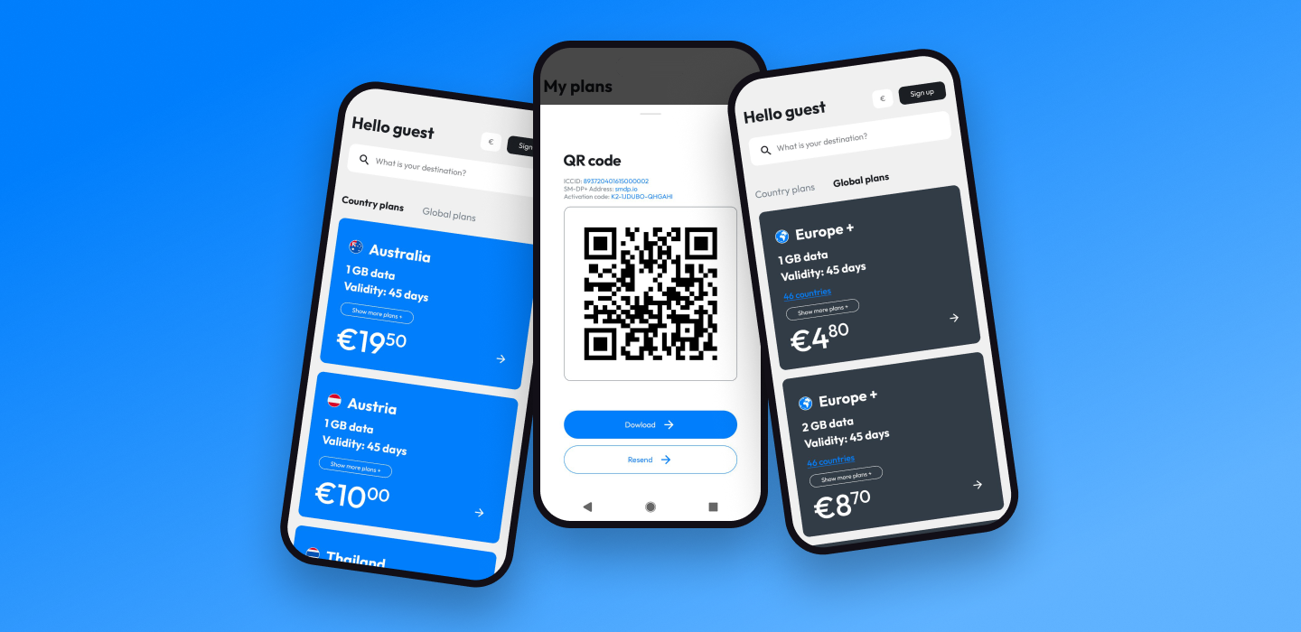
Sparks eSIM app
A redesign of the Sparks eSIM experience on web and mobile: finding a destination, comparing plans, buying and installing an eSIM, and staying connected abroad.
Research
I started with travelers, not screens: app store reviews, support tickets and short interviews showed where people hesitated, mostly around device compatibility and installing their first eSIM.




Personas
Three kinds of travelers came out of the research: the frequent business flyer, the family or group organizer, and the vacationer buying an eSIM for the first time.

Flow analysis
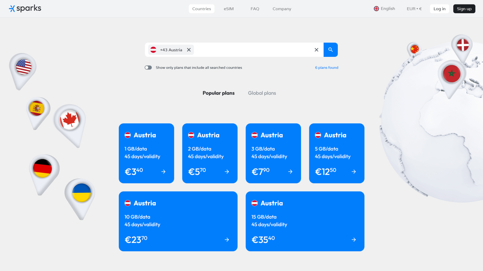
The purchase journey on desktop, step by step with the friction marked: searching for several destinations at once, choosing a country plan, and checking out with a new card.
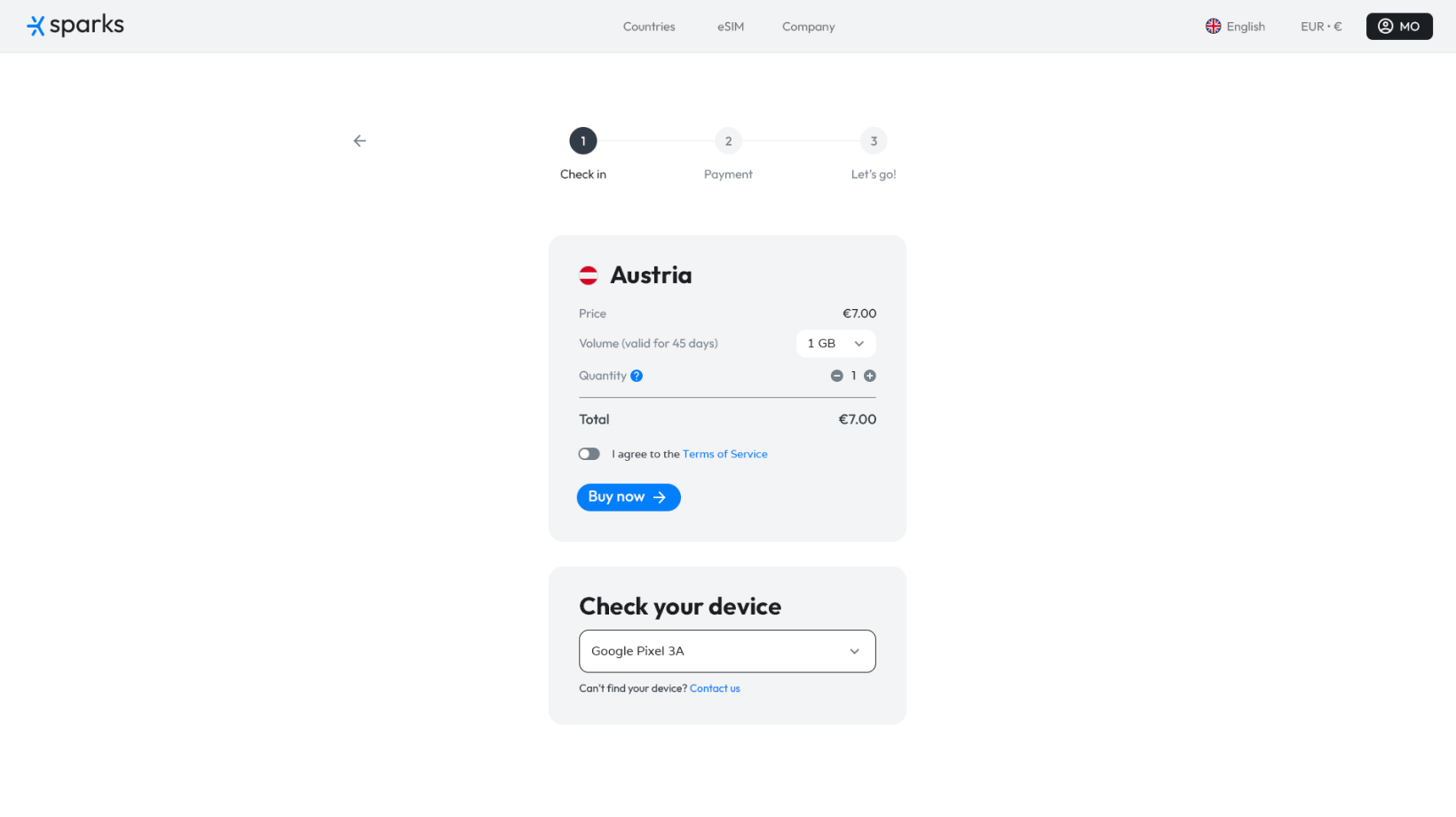
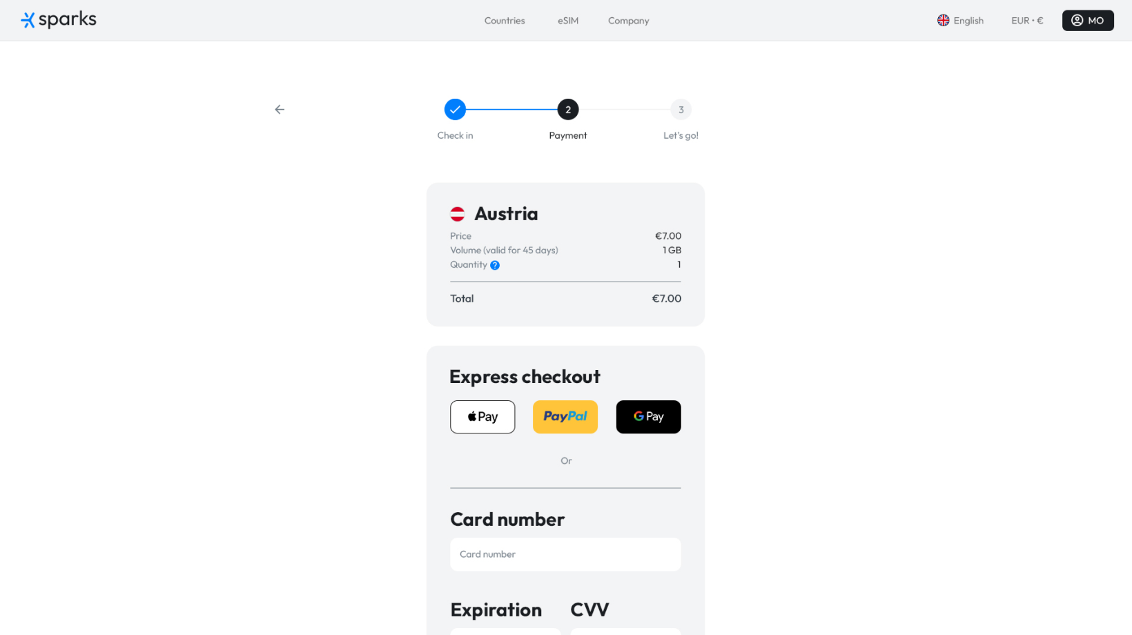
User flow review
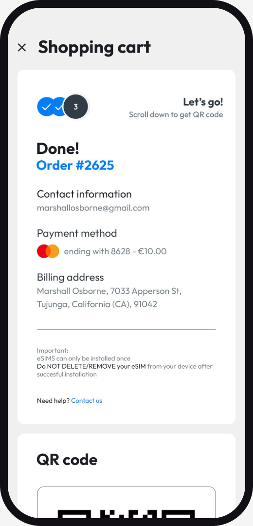
Mobile first, because most travelers buy their eSIM on the same phone they will use abroad. Six screens from the app, in order: onboarding, the shop, finding a destination, plan details, payment and installing the eSIM.


Design concept
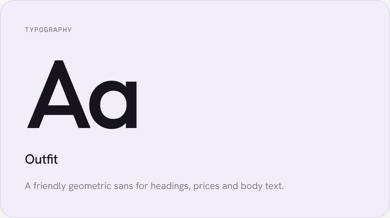
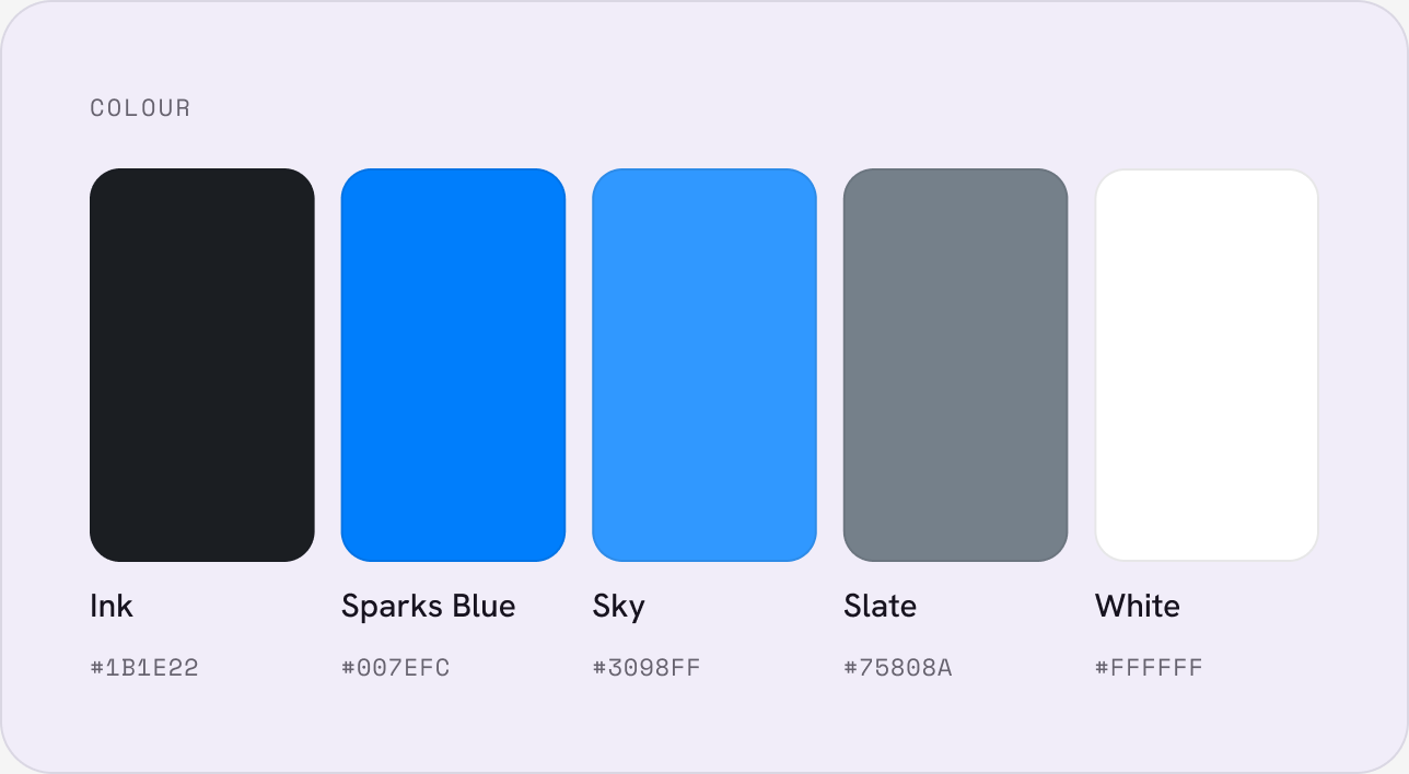
Bright and travel-friendly, but calm at the moment of payment: one confident blue for every action, big readable prices, and friendly 3D illustrations that explain eSIM without jargon.
UI proposal
The redesigned purchase flow as a clickable prototype: destination search, plan cards with data, validity and price, and a guided installation. Trusted by over 15 million travelers and rated 4.6 and 4.8 in the app stores.


